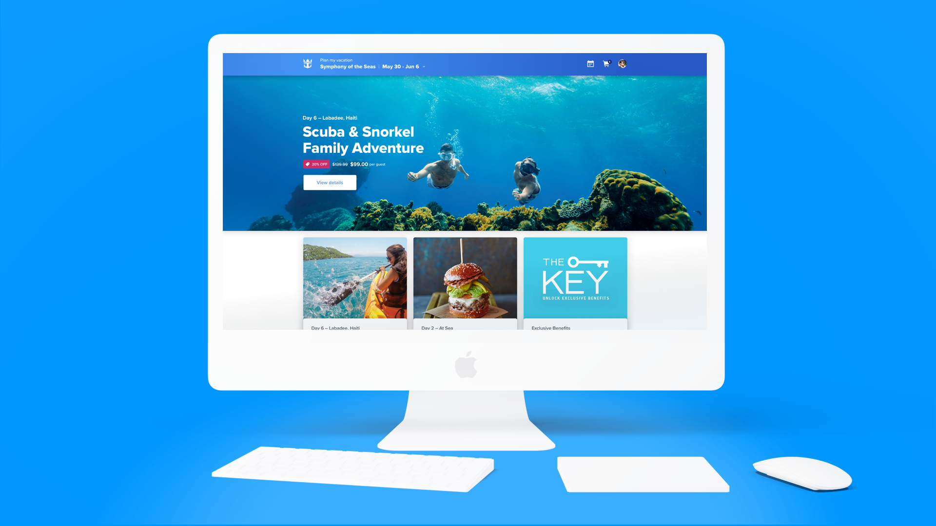
Plan My Cruise Experience
Plan my cruise
In March 2019, I joined Royal Caribbean’s Digital Program, Excalibur, and worked with the Commerce team to overhaul their Cruise Planner experience, which was an e-commerce platform where guests could purchase, book, and plan their upcoming cruise.
To achieve a massive overhaul like this, our team had to solve for many moving parts and own different aspects of the design. We worked from concept to creation, designing key products and flows from end-to-end in order to flesh out the rest of the web/mobile experience. While the entire team essentially touched nearly every part of the site, I primarily owned the booking experience and delivered the web/mobile versions for our key flows including wireframes, visual designs, and interactive prototypes.
The original wireframe, and (in the middle) one of the earlier concepts I created which introduced the idea of bringing the product headline outside of the hero image for better readability and contrast. This idea eventually helped inform the final design with the booking bar.
The product detail page functions with an expandable booking bar that creates a dynamic and clear experience.
The final screen with all the selections made. We eventually did change the design of these pills slightly to adhere to accessibility guidelines (outlines instead of the pale blue-grey fills, as well as darker blues for increased contrast).
The confirmation page affirming that you have completed your reservation or added a product to your cart.
See it in action! The end to end happy path flow for a shore excursion product. This was one of our core flows since it's the most common product we sell.
Responsive mobile flows were created for each key product.
Logistical design challenges
One of the most unique challenges that I experienced while on this project was the need to find the right set of tools for our team to collaborate at such a large scale. Our team’s growing numbers was a strength, but at the speed in which it happened it forced us to be flexible, adaptable, and responsible for aiding in the refinement of our processes and workflow. Some programs that worked well under a team of 3, proved to be a mismatch when we were a team of 8 and waiting to render very image-heavy files (Abstract!). Ultimately, through trial and error, we landed on a few set of tools, a specific naming convention strategy, and a process that relied heavily on our own communication. With many designers touching multiple files, we had to make sure we crossed our T’s and dotted our i’s to preserve the integrity of the designs.
The winners: Sketch, Invision, Jira, Slack, Google Drive, Miro
Honorable Mentions: Abstract, Sketch Cloud, Freehand
Variants/error states/unhappy flows
In addition to the happy flows for each product, we had to design error states, unhappy paths, and resiliency states. One of the most notable and impactful problems we solved as a team was defining what the booking flow would look like when there was a time conflict. For instance, maybe you want to Swim with Dolphins at 8:00am, but you forgot you already booked a Snorkeling excursion for the same morning. What would happen?
One challenge while designing these unhappy paths was the limitations we had on the backend, and the complex business rules that it was based on. I didn't want our new experience to feel like our old one, which felt like it worked harder for the backend system than for the user. We had to make sure that users did not feel this friction in their experience, and for that you have to be within the mindset of cruisers, especially first-time cruisers.
For conflicts, we debated whether different types of conflicts should be colored, and whether the times themselves should be grouped together (as in the original) or bucketed out to let users know beforehand what the path of least resistance is.
The final version of what the times look like when they load with conflicts - they are bucketed out into two categories to help people book easier and faster.
Overall, this project was the epitome of cross-collaboration. The visual I had of myself (and of my teammates) was often like an octopus, balancing all the different facets that one needs to when designing a successful experience. I had to work closely with product managers to define business requirements, copywriters to ensure clear effective language, managers and other designers to collect feedback and get buy-in from our stakeholders, developers for Q&A, our design system’s team to adhere to our accessibility guidelines, and our research team’s findings to ensure we were incorporating the leanings from our usability testing sessions.
BONUS ROUND: Scenes from my experience as an on-board tester on the Symphony of the Seas, December of 2019. During this week onboard I was able to chat with crew members and passengers and interview them about their experience with our app and major pain points in their cruising experience. It was incredibly rewarding and to talk directly with many different people; empathy can only get you so far. Ask me about it!
Plan my cruise collaborators
Aldo De La Paz, Saidelis Mejia, Michael Herrera, Lea Botwinick, Roberto Quiñones, Alice Chou, Jaime Negron


