Comfy Corporate Website
designing with a lot of foresight
One of the many facets of working at a start-up in its early funding stages with a scaling/developing product is that you have to constantly think three steps ahead. Comfy originally launched with its core feature being temperature control, but the team had a bigger vision outside of that. As a member of the marketing team, our team’s main priority with our corporate website was to be able to keep up with the product and be able to communicate that vision as needed. This meant that the ability to change the content on the site as we scale our product was very important. If a new feature was launched, the team needed the ability to create a space for it on our ‘Product page’ without having to redesign the entire layout and send it to the development team. We needed the ability to publish changes ourselves.
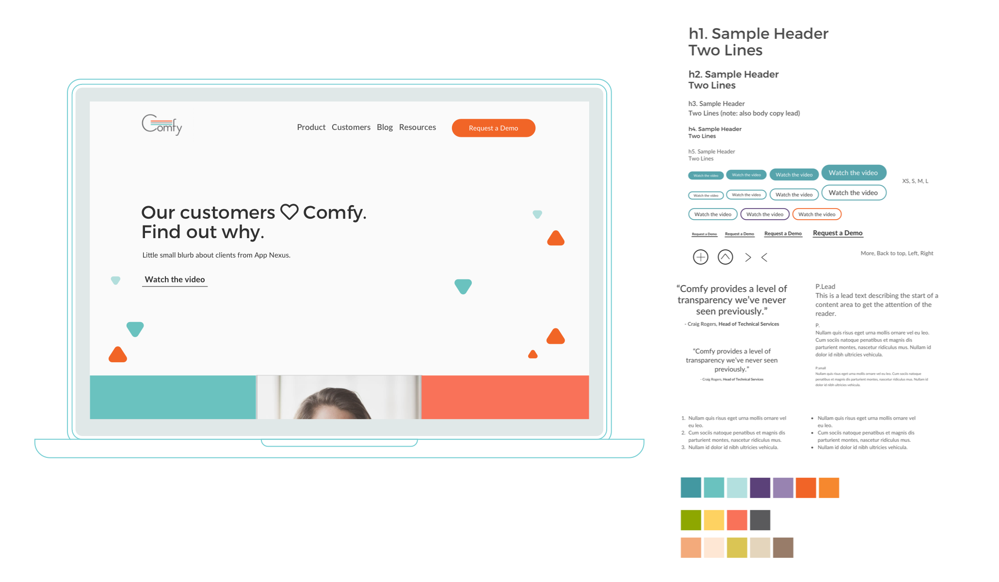
Style guide with our brand fonts and colors
Designing in a modular fashion allowed us to reuse certain grids and repurpose them on different parts of the website. Sometimes I would also design specific widgets and see how they worked with the rest of the already existing page (wireframe 2).
In order to achieve this, we first conducted a web audit of our then live site. We took stats down of widgets and pages that either were no longer needed, or were nested under the wrong headers. We looked for opportunities to simplify and consolidate, and then recreated our site map into a simpler construct with four main pages on our navigation bar.
As a team, we then combed through each page and white-boarded the low-fidelity wireframe of each page. During this process, we would discuss what was needed, invite the appropriate stakeholders to lend us an eye, and make decisions as needed. Then, I took to Sketch to create the mid-fidelity wireframes.
Once these wireframes were created, we would go through rounds of feedback, and then send them off to the development team that was working alongside with us. From there, I’d then meet with the dev team to figure out what was possible, and collaborate on other possible solutions (pairing process), and also discuss micro-interactions. Since we were working within a specific construct of the CMS, my designs were kept fairly ‘modular’ so they can play well within that space.
Each page was designed to then exist as a template/widget that we could then duplicate and customize as needed. This gave us a lot of flexibility, and the ability to create new pages without the need for a development team later since we had already done the work with them up-front.
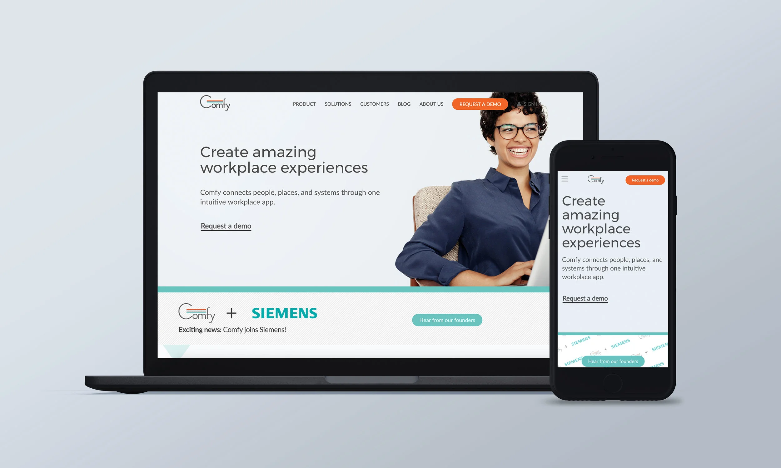
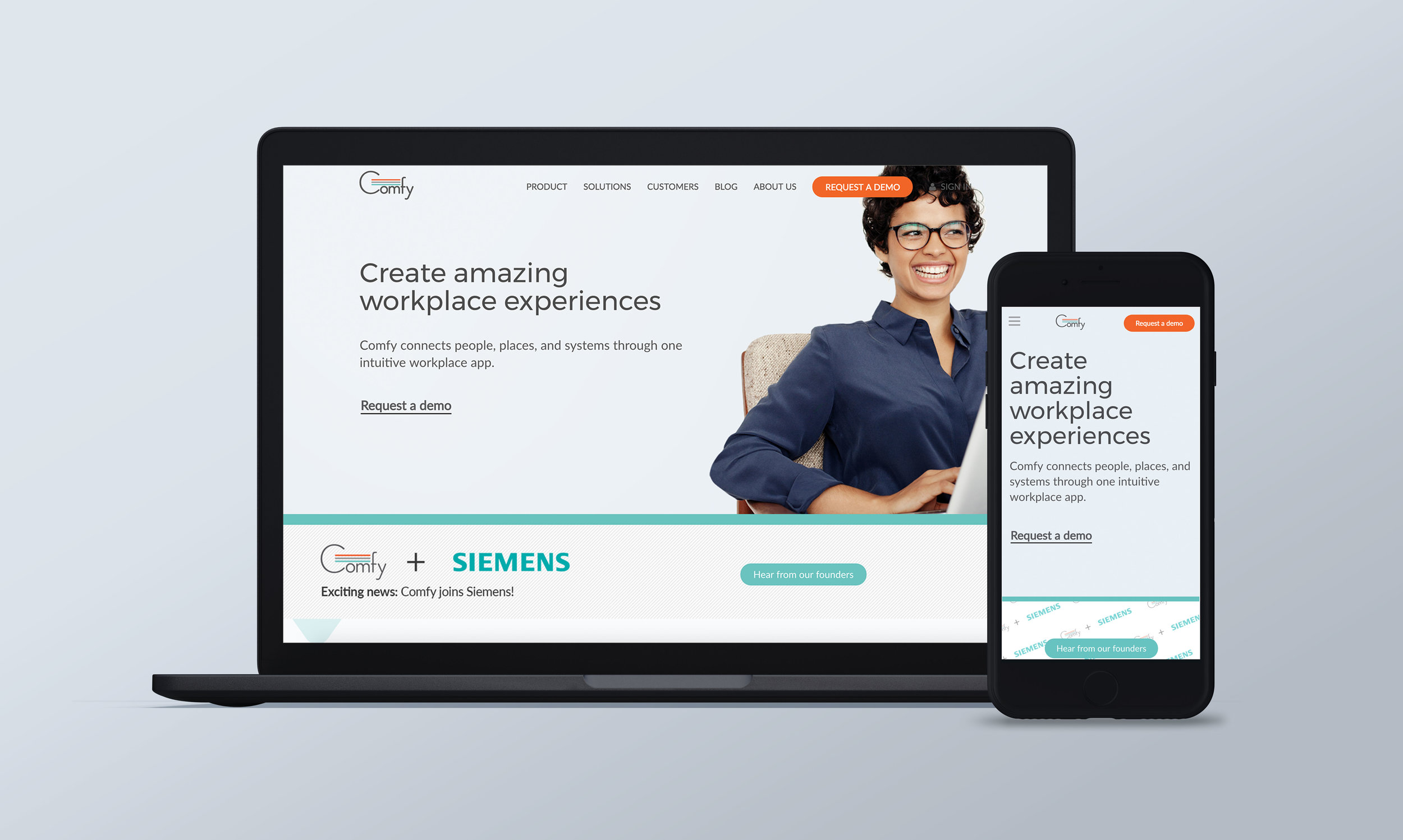
In addition, this gave us the ability to design new widgets for already existing pages. For example, when we were finally acquired by Siemens, we needed to make the announcement on our homepage. The ability to create a simple banner across the homepage was something we were able to do overnight since we had already designed that capability in the early stages.
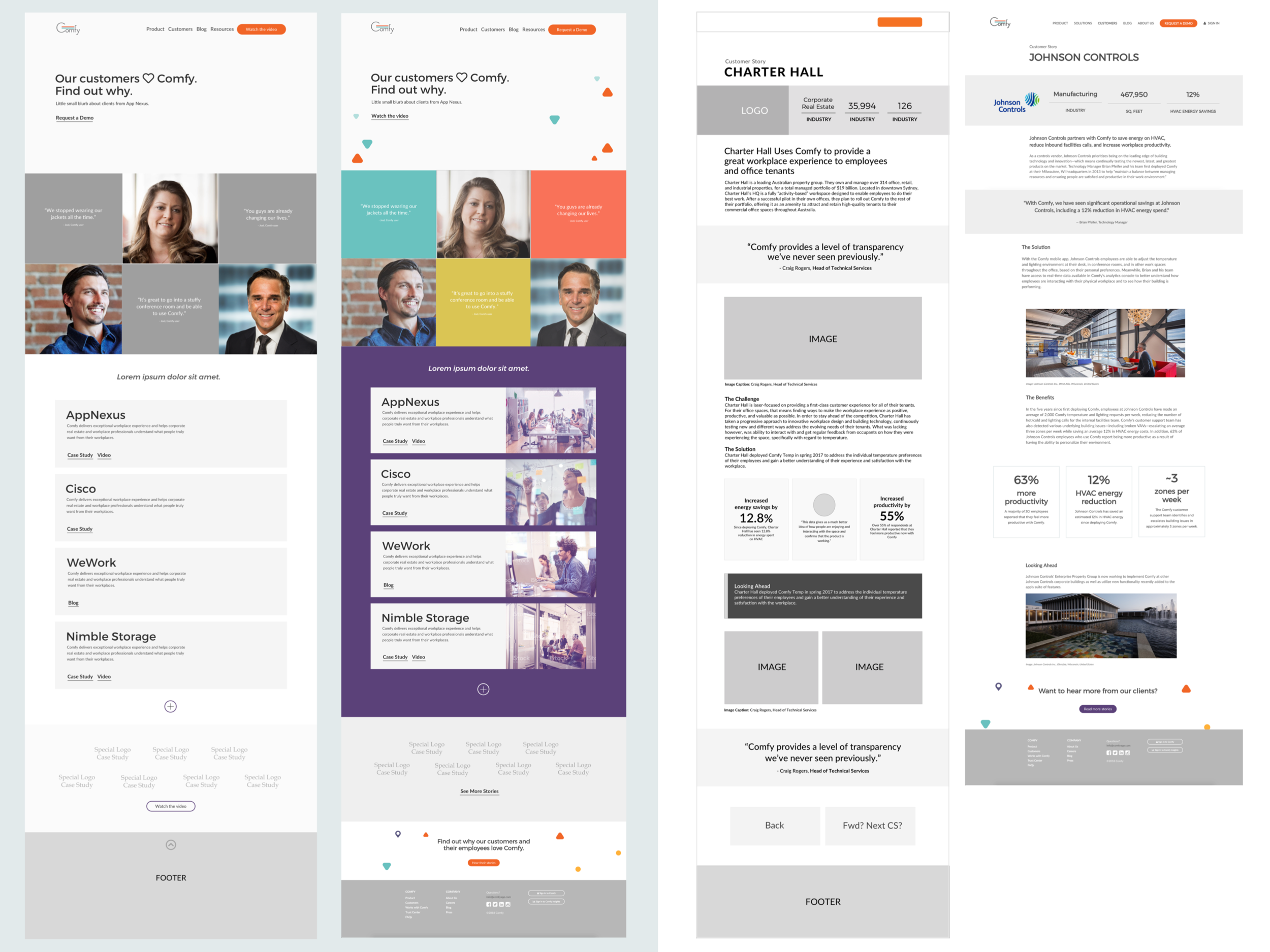
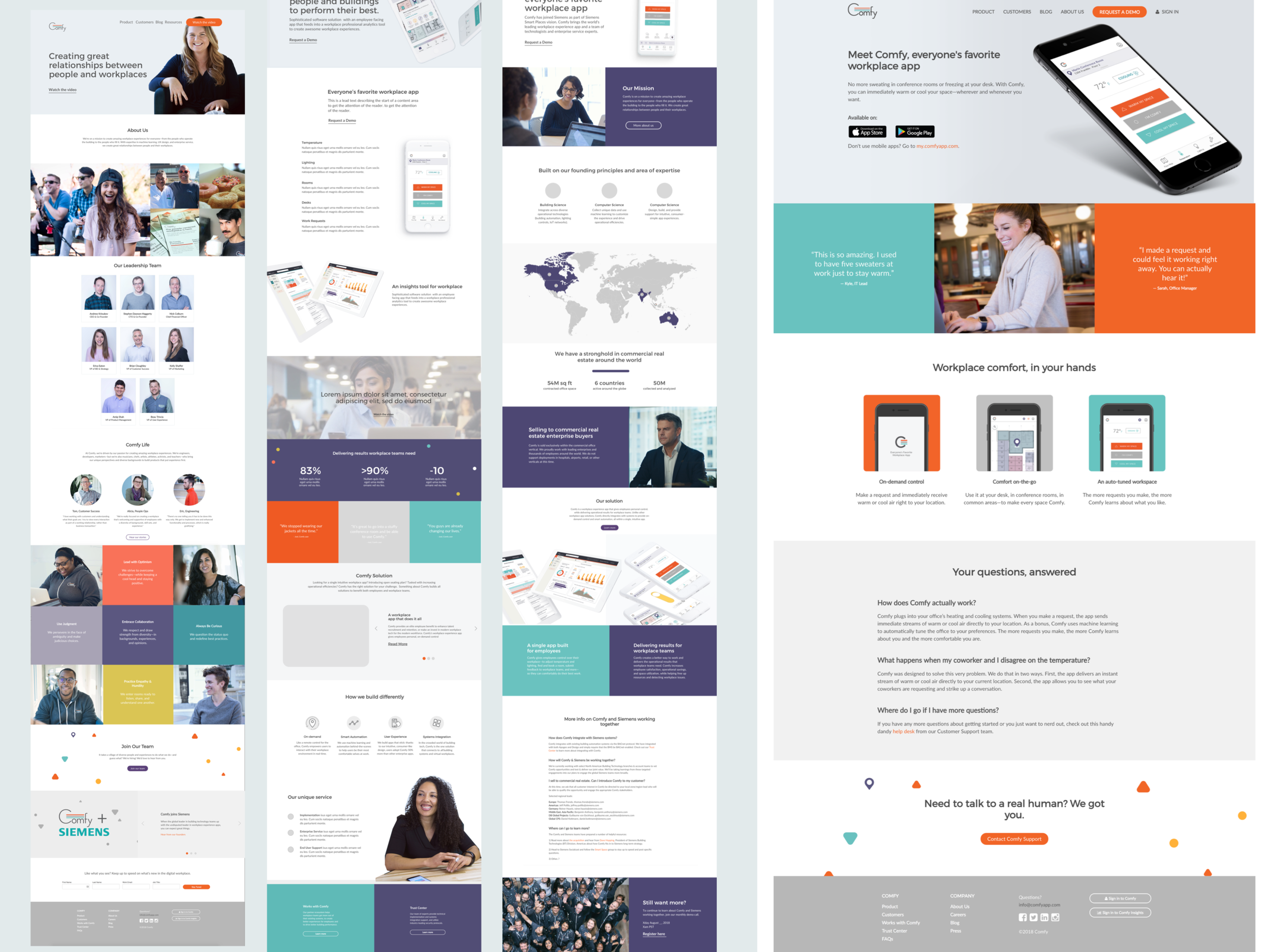
Some mid-fidelity / high-fidelity mockups of the ‘Customers page’ and ‘Case Study’ page