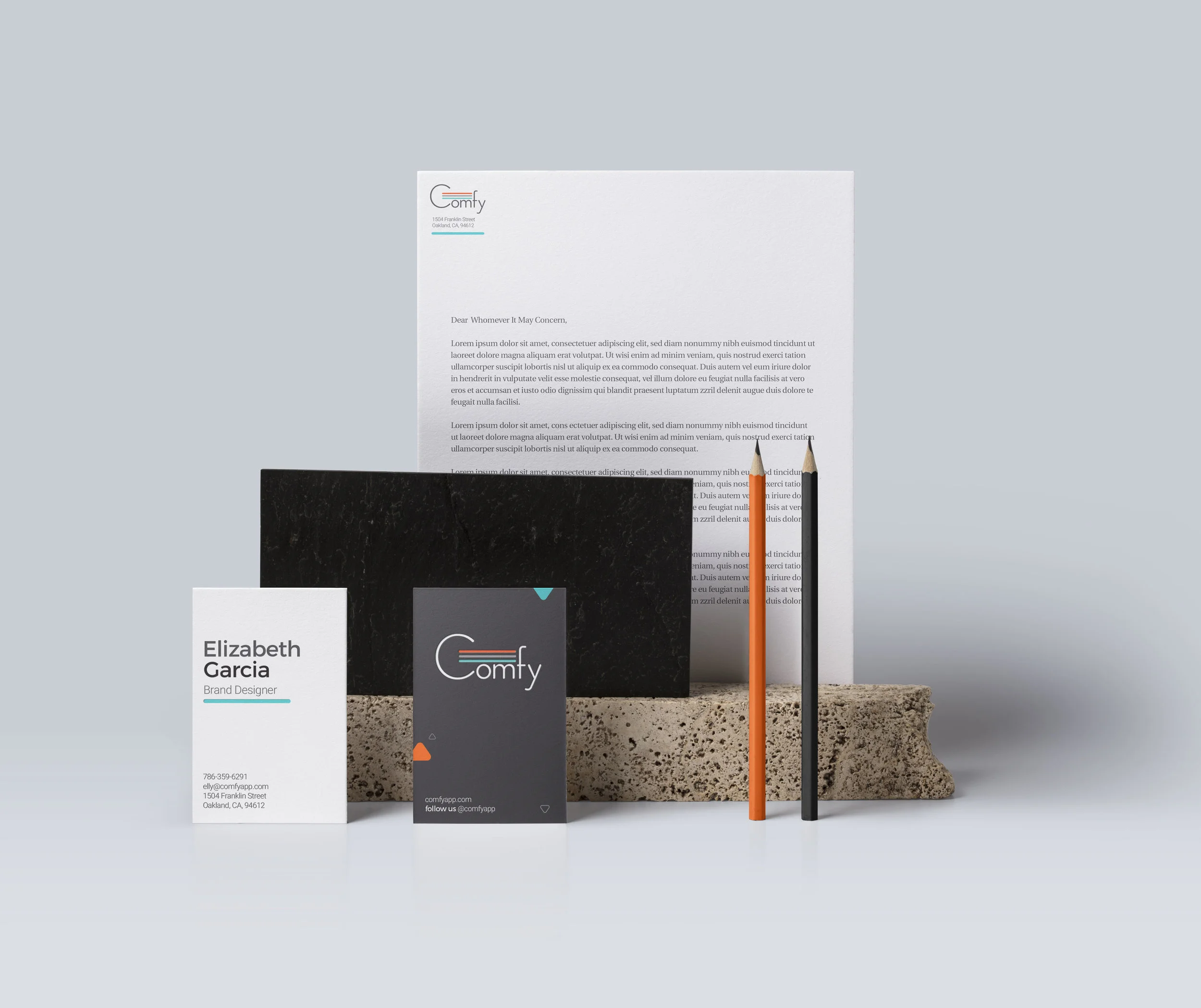
Comfy Branding
During my 2 years at Comfy, the brand saw a lot of transformation in order to keep up with the product as the company scaled up in every way. When I joined Comfy, there were no brand guidelines established, nor any clear delineations on what the voice and tone of the brand should be. It was an exciting time to finally reach the point where the company needed these things, especially because as a marketing team, we were beginning to go full force in our outreach for both buyer and end-users.
As usual, in order to create a strong brand, you need to create a strong foundation. I started with an audit of the brand noting what things had been done before, what elements were working, and what things we needed to move away from (a bit of the MOSCOW method). The marketing/product marketing team had already done robust research on our audiences, product, vision, and stats so I dug around our Google drive and compiled a document with all this information to serve as guide (user personas, empathy maps, sales enablement documents with relevant information, etc). Between the customer support team, I had all the feedback we needed from end-users in one of our slack channels (#voiceofcustomer, #launchday) where they shared anecdotes and feedback from our end-users about Comfy and their experience. For our buyers, our brand was more corporate - we worked with several huge enterprise companies and had a different message and tone for them. For this, we had all our documentation and anecdotes from our sales team and team members who would often interact with buyers at conferences. The marketing team was well-versed in what they needed to hear and see, so knowing that we collaborated and created our overall brand look, with embellishments for our end-users since that needed to be a bit more playful and engaging.
Below are some select pages from the brand guideline, where we cover imagery, fonts, tone, libraries, co-branding, and more. In tandem with this, we also decided to have a password protected Invision brand board that would serve as a library for our clients who needed to co-brand, and our own internal company use. This was to remedy versioning and empower folks to access everything they need in one place, making everyone’s process much more efficient.
Motifs I created for the brand based on our core features
Comfy “Clippy” - End-user sticker
Cheeky phrases based on our “warm” and “cool” function
A peel of sticker with information on how to download the app - useful for launch days and 1st touch with our end users.
Above is some of the sticker schwag created for end-users. We as a team decided to play with the idea of a “mascot” for some time and used him as a character to add more personality to Comfy and punctuate how the app was here to help you create your unique and comfortable environment. We were planning to move away from just temperature, so we had imagined him being sort of a facilitator as we scaled the product into different directions like room booking, reserving desks, amenities, etc. The app would essentially understand your personal settings and patterns through machine learning functions, so again, a way to represent this through a friendly face you can connect with was an idea we thought could promote trust, comfort, and brand loyalty/enthusiasm.
Example of our launch day table with all the assets. I had created a suite of several things for our support team and their launch day efforts including posters, post-cards, stickers, and coasters.
In addition to print collateral, I also helped create on-brand illustrations for several in-app scenarios. I created the on-boarding illustrations, ad well as the illustrations for our tool-tips and error pages.
Below are some examples of the evolution of our brand. These are two different one-pagers geared to our buyers, aka corporate marketing, done at two different times. As the Comfy brand scaled to have more features beyond temperature, the team felt it was important to move away from our color associations with temperature since we now needed to be known as a much broader solution.
Along with the brand guidelines, I had also created templates for different common internal needs. One of them being the almighty Google Slide Deck. This was an effort to quality assure the brand and empower my colleagues with different design options so they can make their presentations more efficiently. As the deck would get used over time by different teams, I would note feedback and recreate slides or edit things that were not working.


